Archive | Portfolio Development RSS feed for this section

Next Week is Spring Break! YAY!

27 Mar

Nice to have two weeks off of uni.

Not nice to still have to do work. That’s life for ya.

Small tweaks have to be made on the headline posters, and a few more modifications to book cover. Seems to go on a bit, huh? :p

And I managed to count almost everything in my anime/manga collection for my info graphics assignment:

  • 147 mangas (not including ones I’m planning on selling!)
  • 92 DVDs
  • 19 Videos
  • 51+ Figures (haven’t bothered looking for my Pokemon figures yet)
  • 12 Dolls
  • 14 Keyrings
  • 3 CD Soundtracks
  • 6+ Plushies (can’t get hold of my Pokemon ones — in baskets on top of my wardrobe!)
  • 7 Posters
  • 1 Bag
  • 1 Purse
  • 3 Pin badges
  • 23 Video Games
  • ?? Other Merchandise (i.e. magazines, trading cards, t-shirts, necklace…)

Some of the stuff is at my boyfriend’s so I can play it (games) or watch it (DVDs). And no, it’s not cos I have too much in the house already!

I do wonder how much I have spent on all of this over the years…… Oh well.

Book Cover and Headline Posters ~ Almost Final

20 Mar

I have done the next stage of my book cover design, where I was told to add colour. I went through a number of steps, and finally came out with this:

There’s also a pdf file of the whole process from beginning until now. (Just a note, this may not be the final. We have given in our work which will be given “forward feedback” for any development) PDF file here of the process.

I have also done posters for the newspaper headline poster assignment, with PDF file here of the stages I went through as I feel it is too long to explain, therefore hoping my sketchbook will do all the talk! Again, this may get given “forward feedback” so it may not be exact finals. But these are the posters.

Also, for some reason the green on the second poster has come out really bright on my blog, which is incredibly weird as this has never happened before, and is originally a more so toned-down green. Apologies for the unsightly thing. I’ll try to sort it out asap. Although, when you click it for the other view it goes back to its original green…. =/

Things that will change with the posters is the size of the headline. Although it has to be small, I think it’s a bit too small. And the hair outlines of the children in the second poster don’t seem to work. The winner really out of them both is the Japan poster.

That’s about it. Still working on logo designs and coming up well now. So sooner or later I’ll post them up along with talking about the case study we have to do based on talking to a professional from our chosen career path (e.g. since mine is illustration, I’ll have to talk to a professional illustrator by asking them particular questions relating to that career).

Anyways, off to do last bit of practicing for my animation presentation tomorrow. Bye bye! ^^

New Book Cover Design

12 Mar

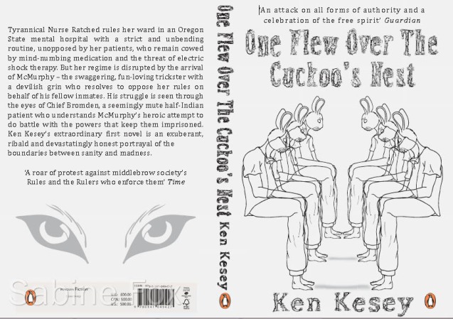
This is the updated version of the book cover for One Flew Over The Cuckoo’s Nest for our second Portfolio Development assignment and Penguin publisher’s competition.

I was told by my module tutor to alter the perspective of the rabbit-head people, change the back cover and the title/author’s name to make it link with the same line drawing style the cover has, which is now what it is:

I’ve been told to make a few more changes, perhaps add a bit more colour to either the title/author or line drawing, same colour as the Penguin logo, but that’s about it.

Posters unfortunately will be shown another day, so I apologise for not showing anything new besides the book cover. But logo designs are gradually climbing up in the able-to-do ladder.

We also got given a new assignment for Portfolio Development, which is to do with information graphics, and has to be based on either our influences, day-to-day life, or a personal collection. Might do a personal collection of my anime/manga stuff since it is a part of me and who I am. There’s quite a bit, though, considering I had some since I was about 5/6 years old. Just have to attempt to find it all, or the majority of it this week : p

Can’t Think of a Title Right Now So I’m Putting This Instead

4 Mar

So at the moment I’m really happy (again) for a number of reasons:

  1. I have fully recovered from being ill.
  2. I have managed to do all the work specified so far (until tomorrow when more will be given!)
  3. I have managed to read some of the manga books I bought since the Hyper Japan event ^_^

Now, as for the work, logo branding of myself is extremely, extremely , extremely hard. And I haven’t been able to think of many bright ideas for it T_T only 12……….. And only one of them I like. Hope I won’t get killed for that little amount tomorrow o_o

I have also done my posters for the news headlines, but I’ll post them up another day with the logo designs.

Done my Penguin competition/assignment book cover jacket design. And I’ll post that up quickly. I am hoping that my tutor for the Portfolio Development module will not tell me to change it. As I am really happy with it. End of. But if I’m told to I guess I’ll have to…. We’ll see. But for now the plan is that I’ll talk about how I gone about the final design another day.


That’s all for tonight now. Off to bed for me.

Night night!

The Busy Bean

22 Feb

Although I was feeling fine earlier today, right now I am not a very well Fox.

This is me right now:

But I’ll try to do this post as there is a bit to talk about since I last mentioned anything.

BE AWARE: a lot of PDF files in this post

All three modules, Portfolio Development, Professional Design Practice and Digital Narratives have all been interesting so far. Deadlines for tasks for all modules are coming fast so sometimes it does feel a bit swamped. But so far I have managed to cope ^-^’

The first part of the assignment for Digital Narratives involves us in doing research on a particular narrative topic and I chose to do animation. So far I have done basic research into the history and different types of animation and this is my presentation and presentation notes which I presented in today’s lesson. Lots of p’s there…. =/

Further research will involve me looking more into different types of stop motion animation and traditional and modern animators who involve themselves in this technique.

I will also discuss how stop motion conveys emotions or any forms of narrative and eventually pick out which type I’ll do. The reason I chose this kind of animation out of all of them is because I like the quirkiness of it and strange to say but I always found it cute seeing inanimate objects move and become all personified. Also it seems more fun (although time-consuming!) to do.

A full-blown presentation will come up in Week 7 (it’s now Week 3).

Portfolio Development has us working on two assignments right now. I’ll talk about the first one we were given:

Called Ripped from the News and from this we had to select 5 headlines from newspapers and design posters that are as reductive as possible. It was hard but I managed it somewhat, and I thought I’d put up the first part of the assignment. Currently I’m planning on digitising four of the posters (the 4th article, which should be the ‘Fabulous at 50!‘ article, I scrapped in the end) — as finals it is two to select as A2 poster formats.

The second assignment is taken from book publishing company Penguin/Puffin who are holding a competition for students in higher Art/Design education. The book jackets we have to design, for the assignment, is one of the books outlined in the competition brief: One Flew Over the Cuckoo’s Nest by Ken Kesey and Grimm’s Fairy Tales by Jacob and Wilhelm Grimm (the competition itself mentions that we can submit one design for both the adult and children’s book).

I am ashamed to say that I have never read any of these books (or seen the ‘…Cuckoo’s Nest’ film) until now (the books that is — not the film). Bought them both in a bookstore last Tuesday and have been reading them when I have the chance. I’m enjoying both and don’t know which one to do. So I might do both for the competition itself and pick one for the assignment. Have some ideas jotted down for them both anyways ^^

Finally, the Professional Design Practice module. With this we have been given weekly tasks to do. Our first task was also taken from a competition that was held by Palgrave/BFI which asked to produce a book cover (only the front) of the 1973 film Don’t Look Now by Nicolas Roeg, with the book by Mark Sanderson. The book mentions of the themes in the film and an interview with Roeg.

I bought the film and watched it all the way through. Was interesting, but weird… Anyways, here is the book cover I designed using Illustrator and Photoshop CS5 (white line is bleed mark):

It looks better on screen than when I printed it on my home computer ._. details are better shown…

You can view the process here. (In case you wonder, I used printscreens I took from the film to do this cover and I did a mock version, shown in the pdf, using those printscreens).

The second task we did was to write up an editorial article (consisting approx. 500 words, 1 image relating to article, title header and 2 columns) based on Identity in the Digital Age. We had to look into the topic and also research on layouts and legible fonts suitable for this type of media. In the end I found a few things on online posts and newspapers/online newspaper articles.

We also had to do a 10-20 point manifesto as a list style containing personal contextualisation and specific aims positioning our future.

Here is the article and manifesto and the printscreens of how I did the image.

Both use Kozuka Gothic Pr6N and Calibri font.

Our next task, which is in for this coming Monday, is to do a self brand and come up with logo designs for ourselves.

Anyways, now I’m tired, my hand and arm hurts from all this typing, and throughout it all I began feeling better *yay*

And I’m really, REALLY, REALLY looking forward to this Saturday for Hyper Japan after 4 months of waiting since buying tickets ^______^

Anime. Manga. Games. And Japanese culture and food galore! <(^o^)>

Night, night!