There have been plenty of changes to the projects in the modules.
For the calendar, I had to do these things throughout the past weeks:
- Firstly, make all the illustrations in a darker colour to the block colours. So no harsh black interferes with it.
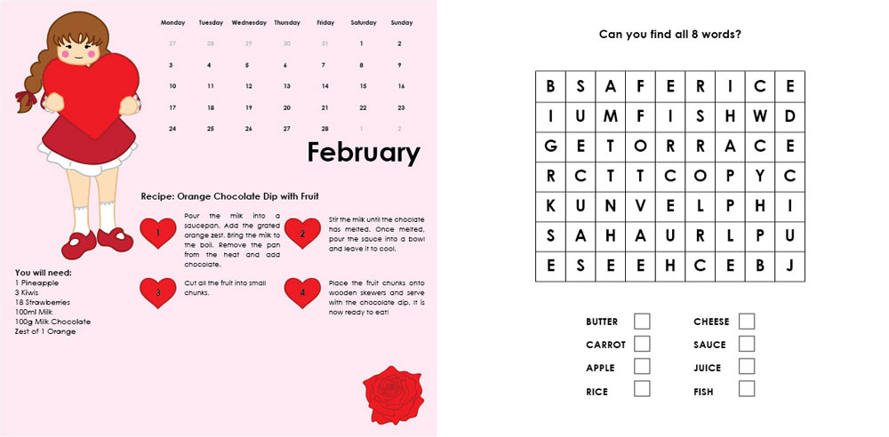
- February: Change lower heart image to something else — too many hearts in one viewing.
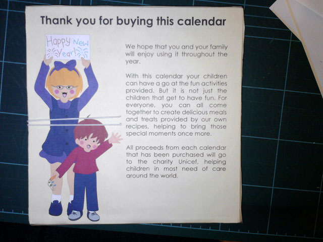
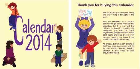
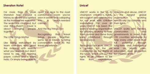
- Add info to the Sheraton/UNICEF (just use text from both websites)
- Change the typography on the front. Makes it too corporate.
Next attempt:
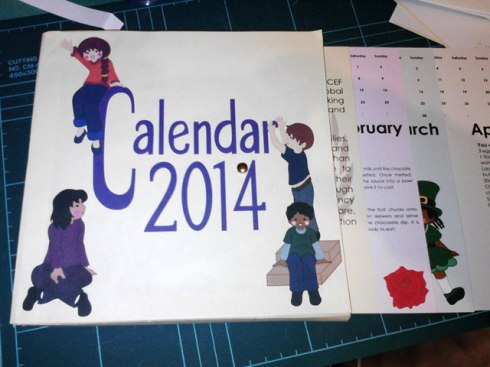
Well after that it was said that the images on the box front does not reflect the drawings that are inside, so place kids at the front and back instead, with the text at the back set in columns.
Did that and came out with this Calendar design. You can also see them below. But in my opinion, the front does not work well compared to the back of the box. The tutor agrees also. So the design needs to be planned out again. It might be the colours, the poses, both, or something else. But it definitely needs sorting.
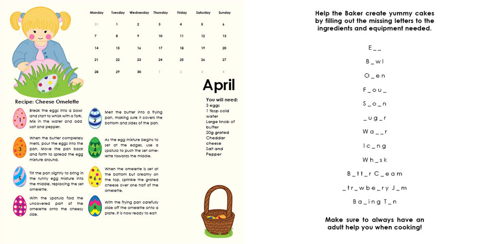
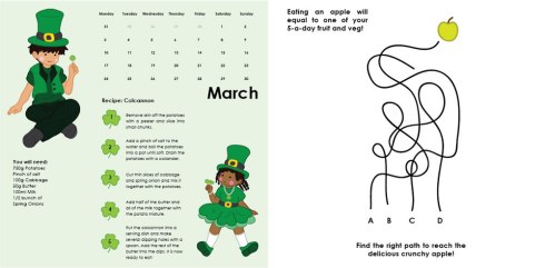
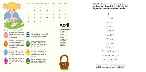
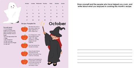
(The recipes in the calendar are only examples and are from books or the internet — just so the client knows what it looks like and that each month has a recipe based on the occasion linked to that particular month).

In case you wonder, this is the box design with the cards:
The box is tied through an elastic attached to the back which comes around the front and ties around the fastener.
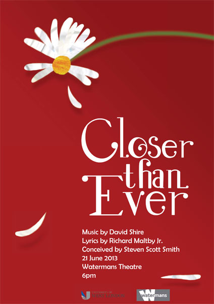
The musical posters have also changed, with these notes taken into account:
Closer Than Ever:
-
Change title typeface — more ‘Art Nouveau’ style
-
All type to right side in line with petal
-
Include logos and musical information
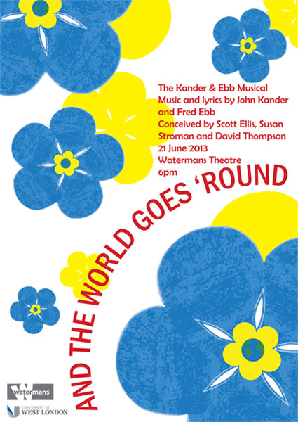
And The World Goes ‘Round:
- Flowers smaller
- Small text brought further down
- Title typeface changed to a sans-serif oblique face
- Logos and Musical information added
- Place a yellow flower shadows for contrast behind original flowers
And these are the final designs. Hopefully they are the final designs.

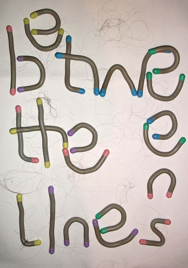
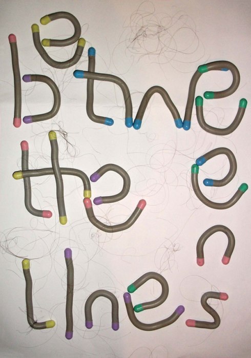
For the Between The Lines project, the idea was really liked by my tutor, who advised me to add hair to it.
That’s it for the Design Portfolio module. There is a new project that’s just started, so there’s not much to it really.
As for Experimental Communication, a lot has been going on. From developing projects more to new ones. From when I did the postcard/Foutaises project, I developed it a bit more by attempting to post out a tea bag (which from my ‘Likes’, was: I like watching a tea bag expand as you pour hot water onto it.
My first attempt in posting it resulted it coming through, but with no tea grains in the bag. When I looked at it, it was deliberately cut. As well as this, it did not get stamped on to certify that it was posted, so I had to send it through again. My second attempt resulted in tea bag not even coming through and torn off from the address tag. Again, no certify stamp so I’ll have to send another one again, fully stapled and on a bigger address tag. Hopefully third time’s a charm.
Another idea I did for the postcard was a scroll which placed all my likes/dislikes written in calligraphy writing, and tied up with a ribbon. Pretty and personal.
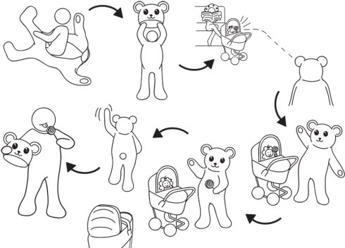
A new project we had to do was visual instructions, with no text. And the instructions cannot be anything simple like how to make a cup of tea. Can be anything fun or ridiculous.
This was mine: How To Take Candy From A Baby:
We have another new project, which I’ll have to read through again as it’s a bit….. I’ll just say riddle-like, but isn’t at the same time :/
For Concept Development and the Sabbatical project, in the end I produced a thaumatrope. One side had a cage and the other had a dog. When spun you would see the dog in the cage, indicating it being trapped with no freedom. When no longer spinning, the dog is free.
A new project was given, where we have to produce a 32-page book on images based from our research and development of our sabbatical. Each image, however, has to be in some form of print, whether it be photocopy, digital print, lino or screen print. The images can be found in my blog for this module.
The other day I had an assessment with my tutors from the Design Portfolio and Experimental Communication. I’m doing well so far and my research is well prepared. The main thing they told me was that I lack ‘edginess’ in my work and need to tap into my ‘dark side’. Also, although my drawings are good, they’re old but not old and needs to tap more into a contemporary form. Hopefully that made sense to you readers. But it was basically like my instructions: although in a similar drawing style to the calendar drawings, it was more contemporary due to its format and black and white style. I don’t know how I’m going to do make my work more edgy, but hopefully it will work out. I do know that they like the way I work with proper materials/objects. We’ll just wait and see.
So that’s about it until the next time : )