Archive | University Year 1 RSS feed for this section

The Things I Have Learnt So Far – The Final

30 May

So after the past week, I have finally finished doing my own version of Duchamp’s Boite en Valise, based on, as you can probably tell, the stuff I have learnt from the Packaging & Branding module. I’m quite happy with the finalised piece, it looks pretty and tidy and portrays me a lot somehow.


I know that it doesn’t look much, but it does contain quite a bit of stuff such as the three previous mini projects that were done (Containment, Milk Project/Promoting the Not-So Ordinary, Wrap It!) as well as this current and final one. It also has blog entries and some objects used from the Wrap It! project. (I have more photos but it’s too many to post!).

This is what I wrote as my report on the assignment (which is on the inside of the lid):

When making my box, I first started planning out what to put in there which I believed I have gained more experience and knowledge from. The main pieces are the projects we had done throughout the module (Containment, Promoting the ‘Not-So’ Ordinary and Wrap It! as well as the process of this project, The Things I Have Learnt So Far). I also included the final outcomes from these projects as I learnt how to make these types of packaging (tetra pack and containment boxes) from their original nets. In the envelopes, I included photographs and blog entries which coincided to each project to show how they were developed and what I learned during that time.

At the back of the envelopes I placed a sticker which I portrayed as ‘my seal’, giving a personal touch to the items and shows that they belong to me. But each sticker was carefully selected depending on what the envelope or the project is about. For the ‘Blog Entries’ I used a sticker that contained an image of a book, portraying reading. In the ‘Promoting the Not-So Ordinary’, I used a sticker that had a cup, portraying a cup of milk. For ‘Containment’, I used a sticker that contained a box, portraying that an item is inside it.

I also tied the objects with ribbon to match the outside of the box and combining and placing the items to their designated project. It was also used to make the objects like small gifts that are only obtained by unravelling the ribbons. I also attached blu-tak to most of the objects so that they stay in their positions on the base of the box.

The box itself was wrapped from A1 canford paper in Aqua (outside) and Champagne (inside). I used these colours as they are both very subtle and contrast well with one another. I also felt that they had a nice texture which most material for gift boxes use. As well as wrapping the box with ribbons to unify it, I also added a tag with written information making it seem like the box is either addressed to someone or belongs to a person (i.e. myself).

From this project, I felt that I have learnt a lot, from making certain packaging to learning how advertisement can be portrayed in a different light, and learning from the designers that have inspired some of the pieces I have produced, by helping me to pick out the correct materials to use or explain the hidden meanings behind the pieces and why they are what they are.

In the box are these:

  • Containment (keyring + information, photos and blog entries related to it)
  • Promoting the Not-So Ordinary (maquette + original carton, designs and envelope with photos and information)
  • Wrap It! photographs and sketches (at back is information of the objects) + 2 wrapped items used for project
  • Blog entries (that are not related to the three projects but to the module itself)
  • Process of making the box (collection of photographs) + related research

It doesn’t seem very much when I look at it now… =/

 Anyways these are the stickers I used on the envelopes as ‘seals’:

I’m hoping it’s all ok, and that I get a good pass mark for this. To be honest, I’m more worried in getting a good mark for this module rather than the other two. I just keep hoping I’ve done it right and it’s fine and nice-looking and not too over the top.

So in about 12 hours I’ll be in uni handing my work in. Good luck to me!

Graphic Novel

23 May

I haven’t been on here in over a week. Been busy finishing up the last bits of our modules and handing them in (i.e. Illustration/Ideas & Development). Packaging & Branding is in for next Tuesday so there’s just about a week to go for that.

I’m quite happy that they’re all done, and really pleased with the outcomes. Ideas & Development, the last assignment was The Future’s Bright which I posted the other week. Packaging & Branding is based on what I have learnt and I’m working on that at the moment. Illustration, as you know, was the Visualisation/Graphic Novel assignment, which I decided to base on the play An Inspector Calls by J.B. Priestley (our final pieces had to involve the front cover and a double-page spread. I did a bit more as I couldn’t find a scene with all the characters, so I did two scenes instead).

I realised that I haven’t even explained what the play is about: The main family, the Birlings, are celebrating their daughter, Sheila’s, engagement to Gerald Croft. They are then interrupted by a mysterious stranger known as Inspector Goole, who questions them on the sudden death of a young girl in an infirmary. As it goes on, you find out how and why the girl commits suicide, with lies and secrets being exposed amongst the Birling household.

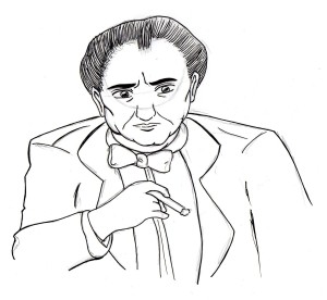
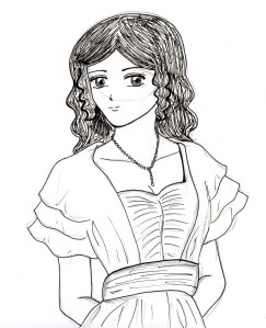
Some of the characters I drew are based on the actors of the film, and some weren’t but the hairstyle or a specific look to them was taken into account and used. And some of them, they were made up. The style is based on my own anime/manga drawing style, however I did not take up the traditional ways of reading it as Japanese manga (right to left) and is therefore  read in the original English ways of left to right. It’s confusing for me to look at though as I’m so used to reading manga rather than normal comics!

These below were my initial sketches of the characters with pencil lines still in tact (some of them I know are not really proportionally correct):

Arthur Birling – husband/father                             Sybil Birling – wife/mother


Sheila Birling – eldest daughter                 Eric Birling – son, younger of the two


Gerald Croft – engaged to Sheila Birling        Edna – maid of Birling household


Eva Smith – girl who commits suicide      Inspector Goole


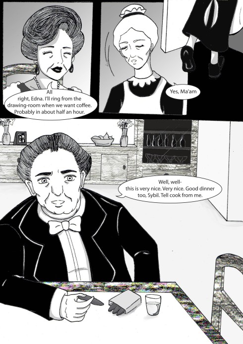
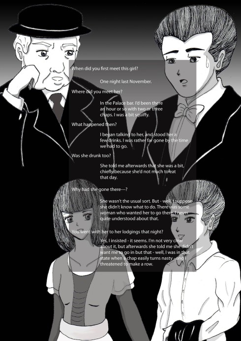
After designing the characters, I drew out the pages/panels for the graphic novel in pencil, outlined it in pen, photocopied it and used the photocopies to scan onto the computer and digitise using Photoshop and Illustrator.

These are the final pieces:

Front cover

Character sheet

Act One

Act Three

My favourite out of all of them is the character sheet, mainly because for some reason, after I did all this and printed it out, some of the characters remind me of these Nintendo DS games called Hotel Dusk/Last Window which adopts the black and white theme for characters in the game. Anyways, if you’re wondering why I did the hair in this way (which is just pen lines) is because I wanted some form of movement on the characters, as well as give them a personality which is noticed by just looking at the hair, which is also what most people do in actual life. The chairs, cabinets and table on the first page is done by using the hard board on the back of my sketchbook and making rubbings of it on a piece of paper. I scanned the rubbing and then altered the tone using the curves tool in Photoshop.

Front cover was done by drawing out the outline of the shadow from a thumbnail sketch I did in my sketchbook, which was scanned in and drawn onto Illustrator. I then added a black/white gradient and afterwards altered it using the filter effect > render > fibres on Photoshop to get the desired effect.

Fonts used – Adobe Garamond Pro (bold); Myriad Pro (regular).

This took me about a week or two from beginning (designing the characters and working out the scenes to draw) to end (final outcomes). I hope you like it as much as I do, it’s the first (partly) graphic novel I’ve done ^_^

What Wonders A Box Will Hold

14 May

New assignment for Packaging & Branding: produce a box (10 x 38 x 40.5cm) that holds relevant pieces which you feel you have learnt from this module. I’ve made a mock-up of the box from cardboard, and I’m quite surprised by how big it is. In depth, mind you, it’s not so big.

Now, it seems kinda easy, but really it isn’t. You have to extract information that you find important to go into the box, so right at this moment besides typing all of this, I’m looking through all of my P&B works done throughout this whole semester (including previous blog entries) and trying to work out what I can place in there. I have a few ideas of what I can use, but it’s also the case as to how to display them in the box. Now that’s going to be the tricky bit.

The Future’s Bright, The Future’s Technology

11 May

So for Ideas and Development, we had to design something technological that will come into the market place in five years time.

I focused on mobile phones, and designed what I guess most people would think of as a kiddy phone, but me personally I’d go and buy it due to its quirky-ness. Inspired by a robot USB hub I have, it’s basically a small robot, or Minibot as I called it, which has voice recognition therefore being password protected and will only work to your voice, so if its stolen, there wouldn’t be any problem of anyone accessing it. But if something happens to your voice (i.e. you’re ill or you can’t talk properly), you can type passwords or general words in using its keyboard by pushing the slot that’s at the bottom. It also has a touch screen which is also 3D compatible and can be sized up to the desired size you want it. And it can connect to other Minibots by its in-built USB cable, where it can exchange contact information, pictures, music etc. It also has cool LED lights, which makes it seem more fun :3

Change in Illustration Assignments

2 May

Thank heavens for there being only four assignments for Illustration. Just found out that I have a choice between doing the giant banner assignment and visualisation one. So I am really glad that I can no longer focus on that mental block and instead on the double-page + front cover for the graphic novel. Right now I’m drawing up the characters and basing them on the actors/actresses from the 1954 film adaptation as I feel that they portrayed the characters in such a wonderful way that it really did seem like them.

It’s quite hard to do, really, as you have to draw the characters in such a way that can be drawn again and again. I’m just hoping I can do that.